Art Fund Pavilion – Architecture Competition
- Stateon drawing board
- OwnerART FUND MUSEUM
- Size35 m2
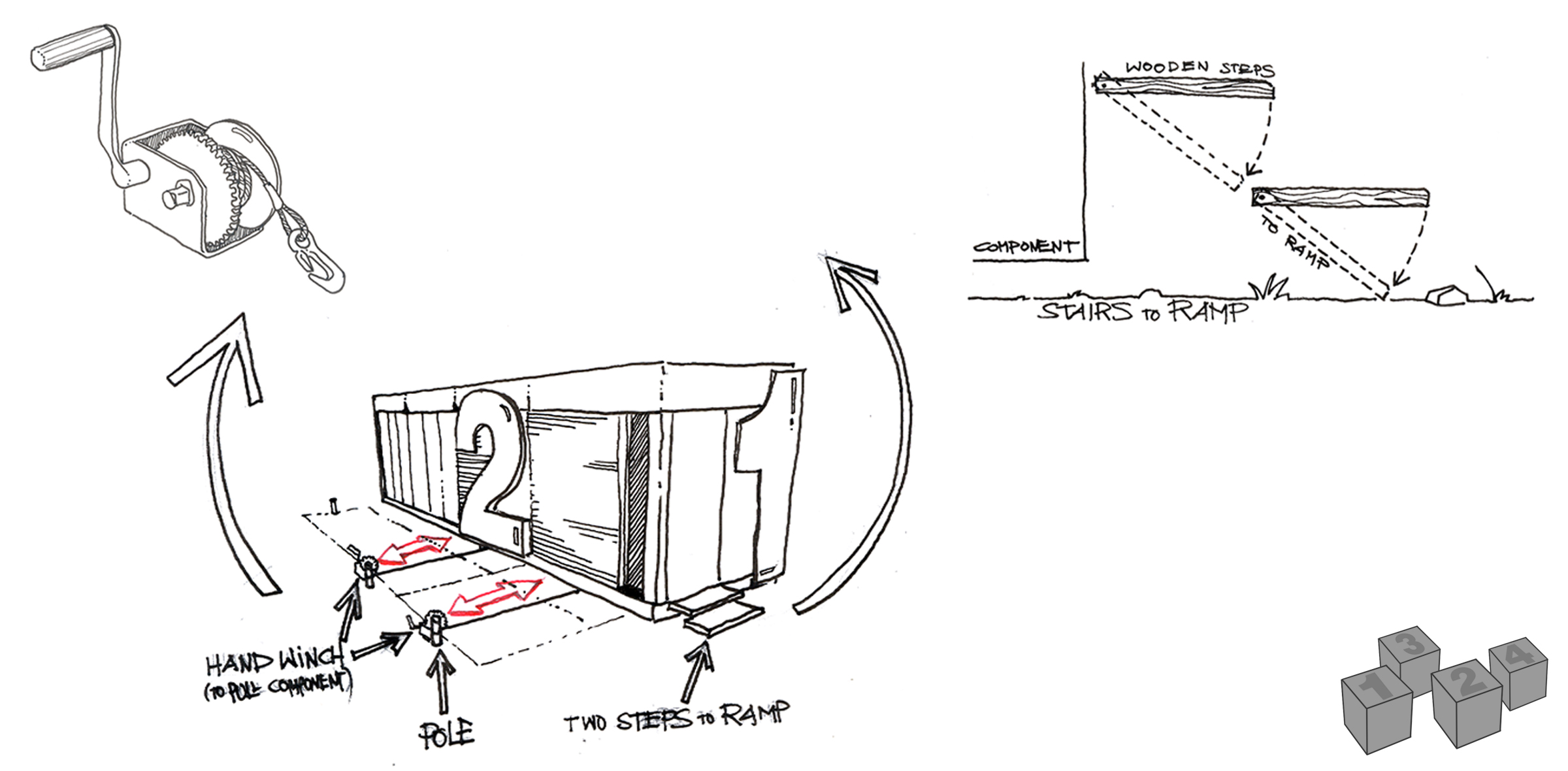
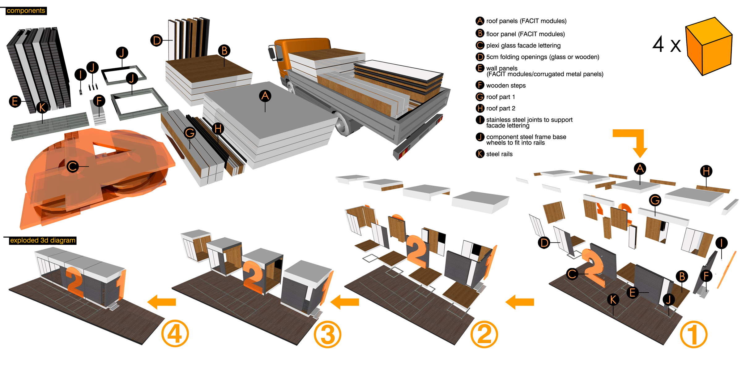
The aim was to create three different spaces through the four components. The function was the factor which determined the modification of the whole. A “linear” array of the four components was decided in order to shape the party shape. This is the scenario that needs the most natural light. The “linear” array allows all transparent sides to be on the outside skin of the pavilion. In case of good weather they can be opened and the exterior space can be used as well. The “zigzag” array forms a more complex and intriguing space, ideal in case of an exhibition. Corners and turns create spaces for exhibition and provide a strong surprise element, since anyone cannot perceive the whole as they enter the exhibition. The “rectangle” array provides a space that maximizes x and y dimensions in order to unfold all of the furniture to assemble a lecture room. Better acoustic and vision behavior as well as a feeling of “togetherness” seal the identity of a “community space” ideal for presentations and lectures. It is essential that the interior behaves with the same flexibility as the 4 components in order to serve the functional needs of the three spaces. This can be achieved through the following: The wall panels can be either fixed or mobile. The rest of the cube’s sides are just void. These, along with the mobile parts, allow the four components to connect and communicate with each other, in order to form the three spaces. Moreover, the moving, folding and mounting furniture allow the three spaces to function separately. The presentation seats fold and unfold into the wooden floor. The plinth-based pieces are based on wheels, so they can be put aside while partying and be used as stands. They can also be used as stands for prospectus in case of presentations. Of course there will be bases for exhibits during the exhibition events. Same use applies to the floor-standing pieces; they can also be used as a stage or pontium during presentations. A1 hangers are made of steel rails mounted in the wooden wall panels.


